.png?width=165&height=66&name=Untitled%20design%20(9).png "Untitled design (9)")

How I read a residential market on the evidence, before I ever name a suburb.
In one breath
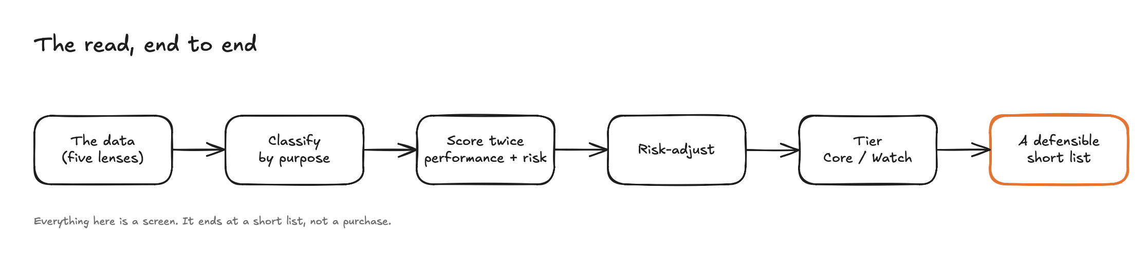
This is the method I use to read a property market. Five lenses on the data, then I sort each market by what it is built to do, then I score it twice (once for how it has performed, once for the risk underneath that performance), then I rank it. The single most useful thing it surfaces is a trade-off most people never price in: the markets that pay the most rent tend to sit in the weakest economies.
It is a screening method. It tells me which markets are worth a closer look. It does not tell me which property to buy, what to pay, or what will happen next. I am writing it down in full because everything that follows in this newsletter is built on it. Over the coming editions I am starting a series called Suburb Notes, where I take one real market at a time and run it through exactly this process, in the open. This edition is the manual. The instalments are the applications.
Fair warning: this one is more technical than usual. I have kept the language plain and shown the actual outputs, because the method is the point.
The problem: a name is not a reason
Ask most people why a suburb is "good" and you get a name, not a reason. They heard it somewhere. They saw a figure. They watched a number move and felt something move with it. That is not analysis. That is hope with a postcode.
The deeper failure is letting one number lead. The same dataset can justify almost any decision if you let a single figure run the show. A big rent number sells the income story. A big growth number sells the capital story. A low price sells the affordability story. Each is true in isolation, and each is dangerous in isolation, because a property decision is a six-figure commitment and the number that sold it to you is rarely the number that decides how it works out.
So the method exists to do two specific things. First, force every market to answer the same questions, in the same order, before it earns an opinion. Second, never let one lens carry the verdict. What you get at the end is not a hot tip. It is a read you can defend, and repeat, when the next market comes along.
What this method is, and what it is not
Before the detail, the boundary. This is a market read. It is the first filter, the part that narrows a whole state down to a manageable short list of markets worth real work. It is deliberately not the property decision (the specific asset, its land content, its condition), not the price decision (a great market bought badly is still a bad deal), and not a forecast (every figure here describes what has already happened, from public data).
To place it precisely, the whole way I read property runs in three tiers, and this method is the middle one.
- Tier 1 — Macro. Which regions are even worth scanning in the first place, driven by population flows, the supply pipeline, and where the broader cycle sits. A separate question, and a separate edition.
- Tier 2 — The market read. Taking those regions and narrowing them to the specific markets worth real work. It has two halves: the past-and-present read (how a market has performed and where it stands today, which is everything below) and the leading indicators of where a market is heading (a future edition).
- Tier 3 — The property. The specific asset, its land content and condition, and above all the price you pay. A great market bought badly is still a bad deal. This is where a market finally becomes a deal.
Everything in this edition lives in Tier 2, and specifically its past-and-present half. Hold that boundary in mind. A method that pretends to do everything ends up trusted for things it cannot do.
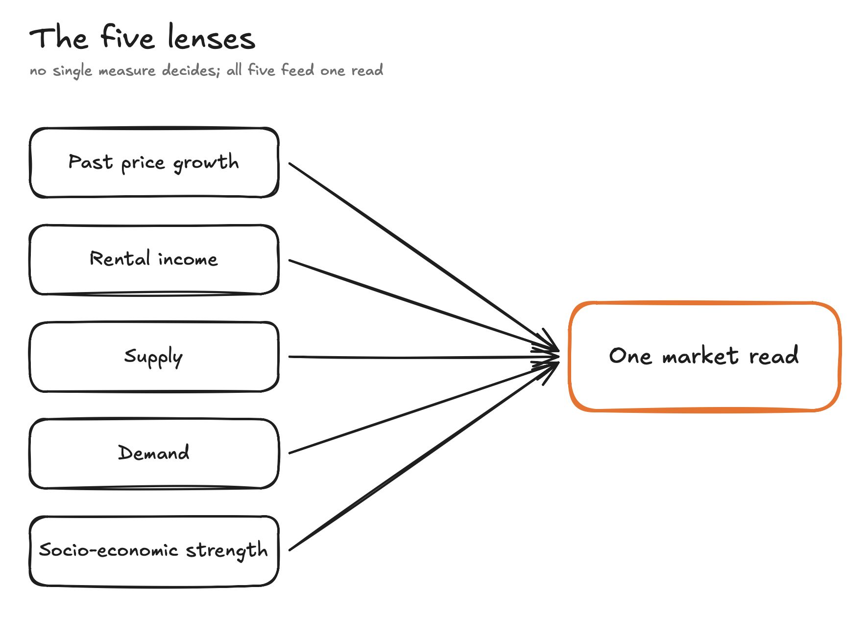
Stage 1: The five lenses
You cannot judge a market on one measurement, any more than you can judge a person's health on their height. I look through five lenses, and only after all five do I form a view.
- Past price growth. How the market has appreciated over the long run. A track record, not a forecast.
- Rental income. What it rents for now, relative to its price. A present-day fact, not a promise.
- Supply. How much stock is for sale, how long it sits, how much is empty.
- Demand. How many buyers are competing, and how fast stock clears.
- Socio-economic strength. The financial backbone of the people who actually live there.
Each lens covers a blind spot in the others. Growth describes the past. Supply and demand describe the pressure right now. The socio-economic lens describes who is underneath the price, and whether they can hold it through a rough patch. One lens lies. Five together rarely do.
Here is what those lenses look like applied to six real markets. To be clear, these six are an illustration, not my list and not the full field. I have picked a deliberate spread across the range, including the kind I avoid, so you can see how the lenses read very different markets side by side.
Table 1: the raw read
| Market | Type | Price | Rental income | Past growth (10yr) | Vacancy | Days to sell | Socio-economic |
|---|---|---|---|---|---|---|---|
| Tingalpa | Growth | $1.18M | 3.2% | 8.8%/yr | 1.1% | 16 | 7/10 |
| Carindale | Growth | $1.80M | 2.6% | 8.4%/yr | 1.2% | 30 | 10/10 |
| Helensvale | Balanced | $1.40M | 4.5% | 9.0%/yr | 3.6% | 26 | 8/10 |
| Ashtonfield | Balanced | $900k | 4.2% | 6.9%/yr | 1.2% | 30 | 7/10 |
| South Kempsey | Income | $467k | 5.6% | 7.4%/yr | 0.9% | 56 | 1/10 |
| Peak Hill | Income | $317k | 5.7% | 12.6%/yr | 0.0% | 80 | 1/10 |
Look at Peak Hill for a moment. Biggest growth, biggest rent, lowest price, zero vacancy. Through any single lens, it is the best market on the page. Hold that thought.
The takeaway: any market can look good through one lens. The job is to look through all five before you believe it.
Stage 2: Classify by purpose, not postcode
Here is the mistake that quietly ruins most comparisons: ranking every market on one list. It is like ranking a delivery van against a sports car. Both are vehicles. They are built for different jobs.
Markets are the same. Some are built to grow. Some are built to pay you while you hold them. A few do a meaningful amount of both. So before I score anything, I sort every market into one of three purposes:
- Growth. Price appreciation does the heavy lifting. Rental income is modest, and that is fine, because income was never the point.
- Income. Rent does the heavy lifting. Growth is secondary.
- Balanced. Both contribute. The rarer profile, where decent rent and steady growth sit together.
I do not compare across these groups. I compare within them. A growth market is not "losing" to an income market because it rents for less. It is doing a different job.
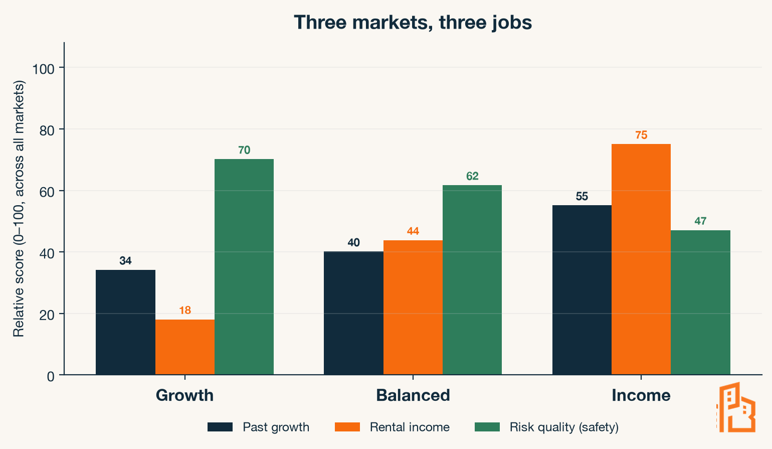
Figure 2 shows the signatures from the full set. Notice two things. Income climbs sharply from growth markets to income markets, exactly as you would expect. But safety falls just as steadily in the other direction. That diverging pair is the whole story of this newsletter, and we will come back to it.
The takeaway: a market can only be judged against others doing the same job.
Stage 3: Hold each market to the right standard
Stage 2 decided what each market is for. Stage 3 asks whether it is any good at that job. Those are two different questions, and keeping them apart prevents two different mistakes. Classification stops me comparing a growth market to an income market. Purpose-fit standards stop me judging a growth market by an income market's yardstick. Skip the first and I compare a van to a sports car. Skip the second and I fail the van for not having the sports car's top speed.
So, once a market has a purpose, it has to clear the bar for that purpose. And the bar is not the same for everyone.
This is where most "frameworks" fall over. They apply one universal filter to everything. The most common is a minimum rent rule: the market must bring in at least, say, five percent of its price in annual rent, or it is cut. It sounds disciplined. It is actually a wrecking ball. Apply that one rule across the board and you delete almost every strong growth market in the country, because strong growth markets rarely rent that high. You have not filtered for quality. You have filtered for one purpose and binned the rest.
When I tested a single universal rent filter against the full set, it cut nearly every growth and balanced market on the board, including the ones with the best long-run track records. The filter was not wrong about income. It was wrong to apply an income test to markets that were never about income.
So the criteria flex by purpose:
- An income market has to clear a genuine rent threshold and a tight vacancy test. That is its reason to exist.
- A growth market is not asked to clear a rent threshold at all. It is asked to prove sustained appreciation and real demand pressure.
- A balanced market has to do a respectable amount of both.
Same rigour. Different tests. The criteria serve the purpose, not the other way around.
Applied to the six markets above, all six clear their own bar: the income markets on rent and vacancy, the growth and balanced markets on appreciation and demand. So all six earn a score. But picture a seventh market renting at 3%. Tested as a growth candidate it sails through. Tested as an income one it fails outright. Same market, opposite verdict, depending on the job you hold it to. That is why the standard has to follow the purpose.
The takeaway: a single universal filter is not discipline. It is a category error wearing a suit.
Stage 4: Score it twice
Now the part that changes everything. I do not give a market one score. I give it two, and I keep them apart on purpose.
The first score is past performance: how the market has actually behaved, built from its long-run price growth and its current rental income. Both are historical, both come from public data, neither is a prediction. A track record, nothing more.
The second score is risk, and this is the one most people skip entirely. It asks how much could go wrong, and how fast:
- How quickly does a home there actually sell? Slow sales mean you are trapped if you ever need out.
- How tight is the rental market? A thin one empties fast when conditions turn.
- How strong is the local economy, and which way is it heading? A market leaning on a single industry is one closure away from trouble.
That last point carries a refinement worth calling out, because it answers an obvious objection. Using socio-economic strength as a risk measure could just punish cheaper areas for being cheap. So I do not only look at where a market sits today. I look at where it has moved over the past decade. A market climbing the socio-economic ladder is a different prospect to one sliding down it, even if they sit at the same rung today. I score the direction, not just the level. A rising area gets credit a stuck one does not.
I keep performance and risk on separate axes for one reason. A big performance number means nothing until you can see the risk sitting underneath it. A high figure with quiet, heavy risk beneath it is not a strong market. It is a strong-looking one.
How the scoring actually works. The measures come in different units (a growth rate, a rent figure, a number of days on market), so first I put each one on a 0 to 100 scale relative to every market in the set. The strongest on a given measure scores 100, the weakest scores 0, everything else sits in between. Then I blend them into the two scores.
Past performance is scored on what the market is for: a growth market on its growth, an income market on its rent, a balanced market on both. So a growth market with top-of-set appreciation scores high even if its rent is modest.
Risk is a weighted blend, and the weights are deliberate:
- Liquidity (how fast it sells, how much stock is sitting): 30%
- Economic strength and direction (the socio-economic level plus its decade trajectory): 25%
- Vacancy (how tight the rental market is): 20%
- Supply trend (whether listings are building or contracting): 15%
- Market size (how thin, and therefore how fragile): 10%
Take Tingalpa. As a growth market its appreciation ranks near the top of the set, so it scores 68 on performance. On risk: it sells in 16 days (fast, strong liquidity), vacancy is 1.1% (tight), the local economy is solid, and it is a substantial market, not thin. Those combine to a risk quality of 73. Now take Peak Hill: its performance is even higher (79, the best on the page), but it sells in 80 days (slow), the economy sits at the bottom of the range, and the market is tiny. Its risk quality lands at 42. Same scoring machine, opposite verdict on safety.
Table 2: the same markets, scored
| Market | Type | Past performance | Risk quality |
|---|---|---|---|
| Tingalpa | Growth | 68 | 73 |
| Carindale | Growth | 61 | 76 |
| Helensvale | Balanced | 56 | 61 |
| Ashtonfield | Balanced | 37 | 65 |
| South Kempsey | Income | 75 | 46 |
| Peak Hill | Income | 79 | 42 |
Scores run 0 to 100 and are comparable within type. And there is Peak Hill again: the highest past-performance score on the page (79), sitting on the lowest risk quality (42). The number that looked best through one lens is the number carrying the most underneath it.
The takeaway: a number you cannot risk-check is not information. It is decoration.
Stage 5: Risk-adjust and tier
The last step turns two scores into something you can read at a glance.
I risk-adjust by multiplying the two scores: past performance times risk quality, where risk quality acts as a safety fraction from zero to one. I multiply rather than subtract on purpose. A fixed penalty would let a big enough performance number always win, however dangerous the market. Multiplying makes risk scale the result instead: a strong track record in a safe market keeps most of its value, while the same track record in a fragile market gets cut down hard.
The arithmetic is plain. Tingalpa: performance 68, safety 0.73, so 68 times 0.73 is about 50. Peak Hill: performance 79, but safety only 0.42, so 79 times 0.42 is about 33. Peak Hill had the better track record and lands well below Tingalpa, because the risk underneath it does most of the talking.
Then I tier each market into one of two buckets:
- Core. Strong enough on both axes to stand on. The markets worth building a real position around.
- Watch. Genuinely interesting, but carrying a flaw serious enough that it does not belong at the front of the queue. Not deleted. Flagged.
Table 3: the same markets, tiered
| Market | Type | Past performance | Risk quality | Risk-adjusted | Tier |
|---|---|---|---|---|---|
| Tingalpa | Growth | 68 | 73 | 50 | Core |
| Carindale | Growth | 61 | 76 | 46 | Core |
| Helensvale | Balanced | 56 | 61 | 34 | Core |
| South Kempsey | Income | 75 | 46 | 34 | Core |
| Ashtonfield | Balanced | 37 | 65 | 24 | Core |
| Peak Hill | Income | 79 | 42 | 33 | Watch |
Peak Hill had the highest raw performance on the page and finishes in Watch. Tingalpa, which never had the loudest number on any single lens, finishes with the best risk-adjusted score in the group. That inversion is the method doing its job.
A note on past growth, because a sharp reader will push on it. High past growth is not a promise of more. Often it is the opposite: a market that has already run. I treat strong past growth as evidence of durable demand drivers worth investigating, never as a forecast that the run continues. The track record earns a market a closer look. It does not earn it a place in your portfolio.
The takeaway: the tier does not tell you what to buy. It tells you what you would be trading away.
Stress-testing the method
Here is the fair challenge to everything above: those scores depend on how I weight the ingredients of risk, and I chose those weights. So are the conclusions real, or are they just my thumb on the scale?
So I tested it. I re-ran the entire ranking five different ways, deliberately distorting the weights each time. I made liquidity dominate. I made the socio-economic read dominate. I weighted everything equally. Five different recipes.
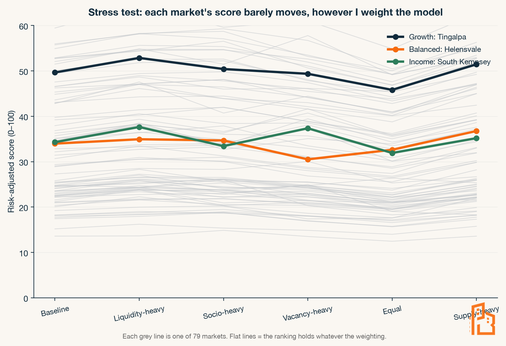
The ranking barely moved. Across all five re-weightings the order held almost perfectly (a rank correlation above 0.98, where 1.0 is identical). The strong markets stayed strong and the weak ones stayed weak no matter how I turned the dials. That tells me something important: the conclusions are coming from the underlying data, not from my choice of weights. If the order had scrambled every time I adjusted a dial, the model would be measuring my opinion. It does not. That is the difference between a scoring system and a story.
Reading the output
When I plot every market on the two axes, a pattern appears that no single market would have shown me.
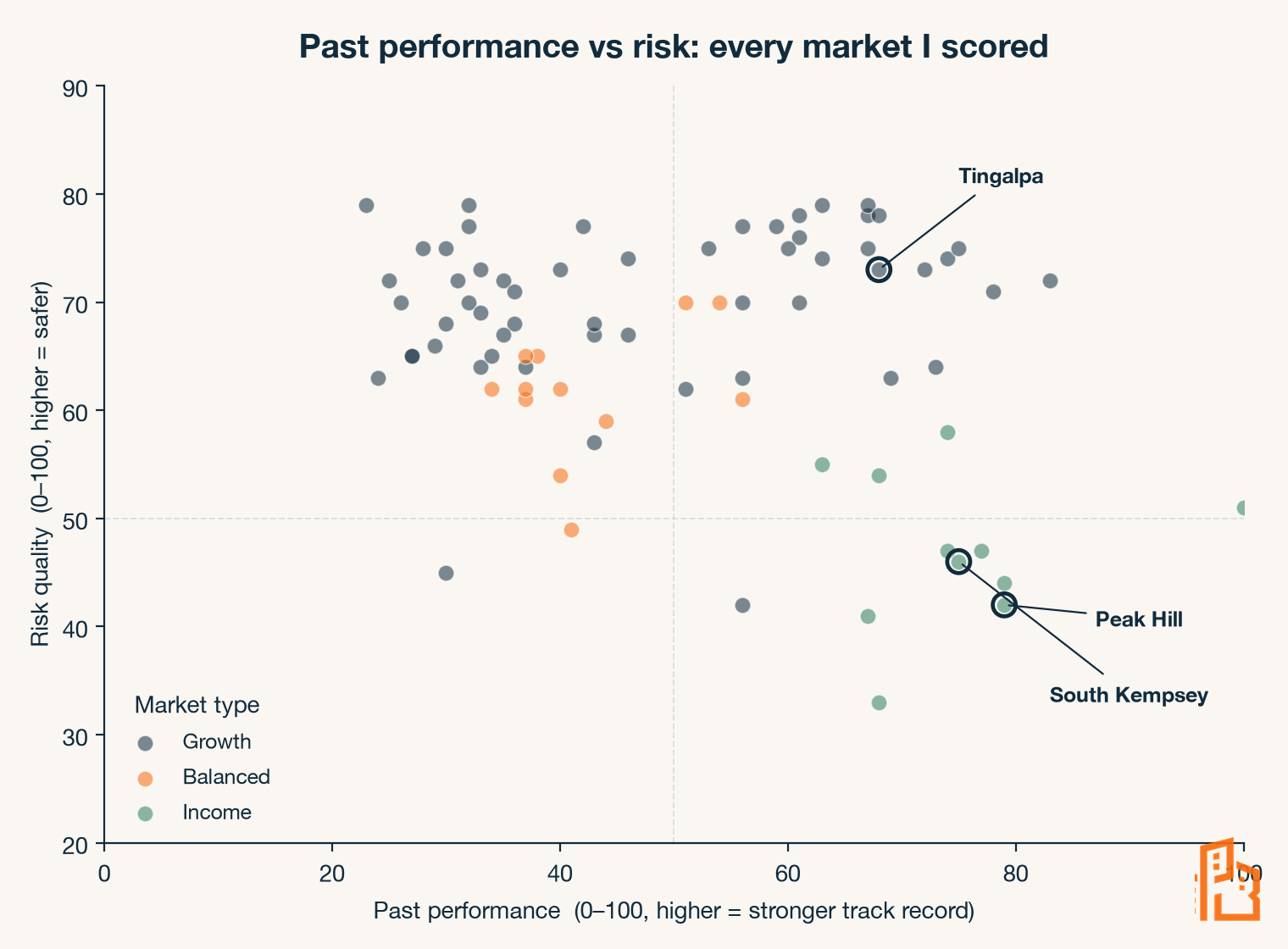
Look at where the income markets sit: bottom-right. Strong track records, low risk quality. The growth markets sit high: safer, with performance spread across the range. The pattern states a trade-off out loud that most people only half-feel: the highest rental income tends to sit in the weakest economies. The markets that pay you the most to hold them are, very often, the markets least able to protect your capital if something breaks.
This is not a revelation to a seasoned operator. Every good one knows it by feel. What the method does is make it visible, measurable, and repeatable, so the trade-off is something you price in deliberately rather than discover after settlement.
The three markets I flagged on the chart make it concrete. Peak Hill and South Kempsey both pay strong rent from a low base. South Kempsey clears in eight weeks; Peak Hill takes nearly three months to sell in a market of a few thousand people leaning on a narrow economic base. Same headline appeal, very different risk underneath, and only one of them lands in Core. Tingalpa, meanwhile, never had the loudest number, and it quietly tops the group once risk is in the picture. None of that is visible if you read the rent figure alone.
Items worth pointing out
A method is only trustworthy if it is honest about what it does not do. Four things worth being upfront about.
It reads the past and present, not the future. Every lens in this edition describes what has already happened or is happening now: past growth, current rent, current supply. On its own, this method scores where a market has been and where it stands today, not where it is heading. That is a deliberate boundary for this edition, not an oversight.
A market is not a deal. Picking the right market is maybe half the outcome. The other half is the specific property, its land content and condition, and above all the price you pay. A great market bought badly is a bad investment. This method gets you to the right street. It does not get you the right house at the right number.
Gross rent is not cashflow. The rental income figure here is gross, a screening signal. What a property actually costs you to hold (after rates, insurance, management, maintenance, vacancy, and the interest rate on the day) is a separate calculation entirely. A strong gross figure can still be cashflow negative. The screen tells you where to look; the modelling tells you whether it works.
The scores are relative. A risk quality of 50 means "around the middle of the markets I scanned," not an absolute. Change the universe of markets and the scores re-centre. They rank well. They are not a universal grade.
None of these are reasons to distrust the method. They are the reasons to use it for exactly what it is: a disciplined first filter, not the whole decision.
How to use this yourself
You do not need my model to apply the thinking. The next time someone hands you a suburb, ask three questions before you ask anything else:
- What is this market for? Growth, income, or both. You cannot judge it until you know the job.
- What is the risk sitting under the headline number? How fast does it sell, how tight are the rentals, how strong and which way is the local economy moving.
- Am I comparing like with like? A growth market and an income market are not rivals. Rank within a purpose, never across.
Those three questions will not give you a score out of 100. But they will stop you doing the one thing that costs people the most: acting on a single number.
What comes next
That is the method. From here, the Suburb Notes series puts it to work. Each instalment takes one real market and runs it through all five stages, start to finish, with the data on the table. The first one lands soon.
And there is a bigger one coming. This method narrows the field to a short list, but it stops at what has already happened. A future edition takes the next step: how to score a single forward-looking signal, where a market is heading, not just where it has been. That is the layer that turns a short list into a concrete choice, and it is the natural sequel to everything here. It is the one I am most looking forward to writing.
A note to close
I did not build this to sound clever. I built it because I have watched good people make a six-figure decision on a one-line reason, and I have done it myself early on. The discipline is not glamorous. Five lenses, two scores, and the patience to look at the risk before the reward. But that is the whole game. The market does not pay for effort or enthusiasm. It pays for reading the position correctly, and then acting. Everything I publish from here is built to help you read it.
See you next week.
— Alex
If this was useful, pass it to someone weighing up their next purchase. And if you are not subscribed yet, you can join the list at pbco.com.au.
Next week, Suburb Notes #1: one real market, run through all five stages, start to finish.
This article is for educational purposes only. It does not constitute financial, legal, or tax advice. Everyone's circumstances are different. Please seek professional advice before acting on any of the strategies outlined above.